前言
译者述
1、原文来自 Jonas Hietala 个人网站上的一篇文章: A simple timeline using CSS flexbox。
2、这是一篇关于 CSS flex 布局的具体应用, 发布于 2024 年 8 月 25 日。
3、翻译中会尽量遵照原意, 也会加入译者的技术注释, 以及选择更符合汉语文法的译句。
4、欢迎指正,非常感谢。
正文
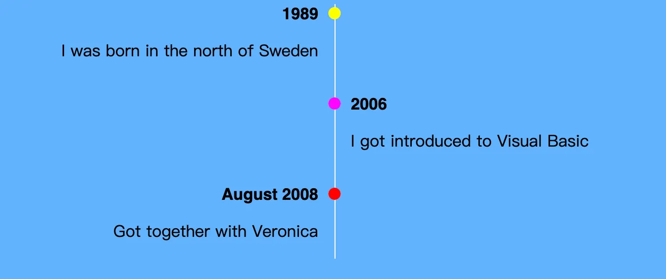
当我在个人网站中添加 now 页面时,我也觉得应该更新一下我的 about 页面。它应该有一个简洁的时间轴来表示我人生中的大事件。
令人惊喜的是,这并不是一件困难的事情,甚至能够很优雅的实现 —— CSS 的 flexbox 真是一个很棒的特性。在本文中,我会引导你来实现这样的时间轴:
注意:如果你使用屏幕阅读器来阅读本文,那么 HTML 示例(如上)将不能正常展示。
(译者注:这里是 iframe 的例子,里面就有完整的代码,直接 F12 查看接口就能获取 html 文件。)
HTML 结构
我喜欢先写 html,再引入样式。我用两层容器(timeline 和 events)来包装多种事件(event),每个事件包含一个记号(svg)和一份详情(content),每个详情包含了时间和文字。
如下结构:
<div class="timeline">
  <div class="events">
    <!-- The first `1989` event -->
    <div class="event life">
      <!-- The circle is an svg -->
      <svg
        class="marker"
        xmlns="http://www.w3.org/2000/svg"
        width="12"
        height="12"
      >
        <circle cx="6" cy="6" r="6"></circle>
      </svg>
      <!-- The event info -->
      <div class="content">
        <time>1989</time>
        <div class="text">
          <p>I was born in the north of Sweden</p>
        </div>
      </div>
    </div>

    <!-- etc ... -->
  </div>
</div>
一条简单的线
让我们来看看时间轴中实际的线。我选择使用 events::before 伪元素,设置一下宽高,然后模拟一条线。
.events::before {
  /* // We need some content for the element to show up. */
  content: "";
  /* // Use absolute positioning to place the timeline at the very top. */
  position: absolute;
  top: 0;
  /* // With a height and with the timeline will be a tall and thin box. */
  height: 100%;
  width: 1px;
}
注意:我们需要设置容器 events 的相对定位,否则时间轴会相对页面来定位。
.events {
  position: relative;
}
我还添加一些样式,这样更好看一点:
/* // For the tutorial I use slightly different colors, */
/* // but you get the idea. */
.events::before {
  background: white;
}
/* // Events use different classes to differentiate them. */
.event.life .marker {
  fill: yellow;
}
.event.programming .marker {
  fill: magenta;
}
.event.family .marker {
  fill: red;
}
/* // Make the time stand out */
.content time {
  font-family: concourse_4, Helvetica, sans-serif;
  font-weight: bold;
}
/* // Just some extra spacing to make the timeline not merge */
/* // with the surrounding text. */
.events {
  margin: 0.5em;
}
然后我们就得到了一个时间轴:
对齐
圆圈和事件信息没有对齐,我们来修复它。
通过使用 flexbox 布局,事件信息可以水平展示(圆圈在左,事件信息在右)。
.event {
  display: flex;
}
更接近了,但是圆圈似乎偏移了。注意,圆圈是一个宽高 12px 的 svg,默认是 (0,0)的定位。
通过相对定位,可以将圆心更好的对齐:
.event .marker {
  position: relative;
  left: -6px;
  top: 6px;
}为了解决这个问题,我发现 align-items: baseline 比微调 top 位置更有效:
.event .marker {
  position: relative;
  left: -6px;
  top: 0px;
}
.event {
  align-items: baseline;
}垂直间距
如果感觉有点狭窄,我们让间距更大一点。一种办法是简单地添加 margin-bottom:1em; 但是这会在最后一个事件消息后面加上无用的间距(并且还不能去除)。
我想到一个简洁的办法就是利用 flexbox 和 row-gap 去指定元素之间的间距。
.timeline-5 {
  .events {
    display: flex;
    /* // Lay out events column-wise instead of row-wise. */
    flex-direction: column;
    /* // Set some spacing between elements. */
    row-gap: 1em;
  }
}我们现在的样式对于小屏幕来说很友好,但是对于大屏幕来说却不同。对于大屏幕,我想把这条线放在中间,把一些事件移到左边,另一些移到右边。
我使用媒体查询设置边界:
@media (min-width: 700px) {
  /* // Styling for wider screens goes here. */
}
Even though I won’t include the media query in the following code snippets the media query should wrap them all.
下文我就不再重复写媒体查询的代码片段了,但是你应该知道,这些代码是被包含在媒体查询结构代码里面的。
事件移动靠左
首先我想要做的就是将时间轴移动到中间:
.events::before {
  /* // This centers the line horizontally. */
  /* // Remember that we used absolute positioning before. */
  left: 50%;
}(译者注:手动拉伸一下,对比效果。)
Now, let’s move the marker to the timeline. First lets move the marker to be after the content in the layout ordering:
现在,让我们把圈圈移动到时间轴上。
第一步,将圈圈移动到文本的后面:
.event .marker {
  order: 1;
}.event .content {
width: 50%;
}.event .content {
text-align: right;
padding-inline: 1em;
}为了将事件移动到时间轴的右侧,我们需要修改 flexbox 布局,用从右到左的方式来布局元素。
/* // Use `nth-child(even)` to target every other event. */
.event:nth-child(even) {
  /* // Layout elements from right to left. */
  flex-direction: row-reverse;
}
(译者注:这里的 nth-child 是指选择第几个元素,偶数就是 even,奇数就是 odd。)
小提示:对于 blog 我不喜欢按照奇偶来分两侧,而是按照内容来分。
.event:is(.programming, .work, .projects) {
  flex-direction: row-reverse;
}
为了显示好看,右侧的事件内容需要坐对齐:
.event:nth-child(even) {
  .content {
    text-align: left;
  }
  /* // The marker used to be offset -6px, but now we */
  /* // move from the right. */
  .marker {
    left: 6px;
  }
}这就是我所使用的时间轴啦。当然,你可以进一步修改和扩展它,只是我个人非常喜欢这种简单的样式。
使用 flexbox,创建一个基本的时间轴是相当简单的。flex 是我最喜欢的 CSS 特性之一,它解决了许多以前难以处理的问题。
下面是全部的样式文件:
/* 略 */(译者注:完整的样式文件从上面的示例(iframe 引入的 html 文件)中获取即可。)